In the first part of our guest blog, Tu Books Editorial Director Stacy Whitman and designer Isaac Stewart discussed how they came up with the cover concept for the novel Vodník. In part II, they share covers they considered and explain how they came up with the final design.
Isaac: By the time we chose a direction for the cover, I had created something like twenty-two thumbnails. I’ll admit, I went a little overboard, but I really wanted to give Vodnik the attention it deserved. And honestly, it was hard work finding the desired balance between ominous and whimsical.
COVER 1: THE HORROR
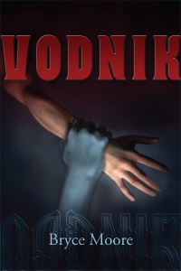
Isaac: This cover has a lot going for it, despite my getting the color of the vodník’s arm wrong. Initially, I wanted to have a hand thrust up out of the water, a crushed teacup in its grasp. As I searched for images that matched, I found this one and decided it played off the ominous feeling I was hoping for. I tried the whole fire and water dichotomy with the colors of the title and byline, and was hoping that the text itself would carry the Eastern Block feel. The large, in-your-face title was a precursor to what we wound up using on the final cover.
The biggest problem with this cover was it looked like a horror novel, almost completely ignoring the fantasy and whimsy that are also big parts of the story. To tell the truth, it didn’t even look like a YA book.
Stacy: Yeah, this one just wasn’t working for me. It looked too horror-y, and didn’t have the right sensibility that I was going for. Which brought us to…


