In the first part of our guest blog, Tu Books Editorial Director Stacy Whitman and designer Isaac Stewart discussed how they came up with the cover concept for the novel Vodník. In part II, they share covers they considered and explain how they came up with the final design.
Isaac: By the time we chose a direction for the cover, I had created something like twenty-two thumbnails. I’ll admit, I went a little overboard, but I really wanted to give Vodnik the attention it deserved. And honestly, it was hard work finding the desired balance between ominous and whimsical.
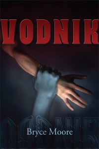
COVER 1: THE HORROR
Isaac: This cover has a lot going for it, despite my getting the color of the vodník’s arm wrong. Initially, I wanted to have a hand thrust up out of the water, a crushed teacup in its grasp. As I searched for images that matched, I found this one and decided it played off the ominous feeling I was hoping for. I tried the whole fire and water dichotomy with the colors of the title and byline, and was hoping that the text itself would carry the Eastern Block feel. The large, in-your-face title was a precursor to what we wound up using on the final cover.
The biggest problem with this cover was it looked like a horror novel, almost completely ignoring the fantasy and whimsy that are also big parts of the story. To tell the truth, it didn’t even look like a YA book.
Stacy: Yeah, this one just wasn’t working for me. It looked too horror-y, and didn’t have the right sensibility that I was going for. Which brought us to…
COVER 2: DEATH ON DUTY
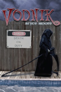 Isaac: My absolute favorite of the concepts! This was a composite of six different images, and I’m quite proud of how it turned out. Here, we started to get a better balance of the humor, the fantasy, and horror of the book. I really miss this cover, but there were some issues that we just couldn’t get around.
Stacy: My favorite as well! I LOVED it and my first impulse was to go with this one. But the author, Bryce Moore, made some good points that caused us to rethink this one. The most important is that this book is set in Slovakia. The sign is in English. Were we giving off too much of an American Dead Like Me air? Were we focusing too much on Death above the titular vodník character, forgetting the core of the book being about a human teen guy who’s figuring out his life? And again–and this was a point someone brought up in-house as we were discussing our options–given our mission to showcase main characters of color, was there a way we could show his face and have it work just as well or better? I still think this might make for a great promotional piece, but I just wasn’t convinced it was best as the book’s *cover*.
COVER 3: THE ELEMENTS
Isaac: A lot of the ideas from this comp wound up in the final. But wow, how different they look! This was too ominous without the fantasy or whimsy element.
Stacy: There was a LOT to like about this one. I loved the font treatment, and I liked the fire/water juxtaposition. I loved the fire on his hand. I think my main worry about this one was that there was more possibility for including a touch of whimsy in some of the other concepts. I also felt like the figure and the castle were too small, that we needed to zoom in.
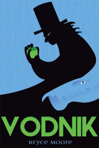
COVER 4: WICKED
Stacy: Gorgeous! But both too old (Broadway musical-esque) and too young (middle grade illustrated cover) at the same time.
COVER 5: “A FISH CALLED VODNIK”
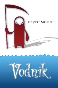 Stacy: I wanted to incorporate that idea of Death, but also imply the other concepts, without overburdening the design. But the reaper dude stuck in my head.
After Isaac turned in these concepts and several more, I sat down with several of my coworkers, such as my publisher, our company vice president, our marketing staff, and others, and asked for their opinions.
The feedback in these meetings really helps. Generally, I’m the one with the final say on the book covers, but I like to meet with others in the company to get more feedback, and they often make great points that I might not have thought about from my perspective about what they like to see in certain markets, and things they’ve noticed. And the thing we kept coming back to is that we want to showcase that these books we publish are not afraid to show the person of color who stars in the book on the cover. If an iconic cover is the better concept, I won’t reject it for not showing the character, but if we do show the character, let’s showcase him.
Eventually, Isaac came up with this:
COVER 6: GETTING WARMER
Stacy: Obviously, the African American featured here isn’t Roma, but he was in a pose that showed what we were going for, which allowed us to then plan a photo shoot with a model who looked more the part of Tomas. And wow, that fire! This really accurately reflected the book’s content in both a concrete and symbolic way, and I loved the reaper dude’s appearance on the t-shirt. This was a winner, for me and for everyone I showed it to.
Isaac: We hired a photographer and a model and did a photo shoot, the results of which I composited with some of Bryce’s original photography from a visit to Trenčín–the castle, the vodník fountain, a man’s arm on fire, that sort of thing. I wanted the cover to jump off the shelves, whether face out, or spine out, and I think we all came together to create something that will do just that.
COVER 7: FINAL
 Stacy: What it came down to was that we needed the cover to look like it fit in the YA section, but still stood out in it. That’s a fine line to walk, as well as the line between conveying everything we want to convey and getting a cover that’s too busy, and the line between whimsy and serious. I think the final cover ended up doing all of that and more–there’s a lot there that you might not catch at first glance, yet it’s not so busy that it overpowers the design. And many thanks to our model, photographer, stock photo providers, and most of all, Isaac, for making it happen.




5 thoughts on “Design 101: How a Book Cover Gets Made, Part II”
Comments are closed.